Unless a designer is working in a bigger organisation where roles may be very much divided and specialised, then the designer also needs to be an artworker. A good visual for a logo, a brochure layout or web page (just to mention a few things a designer gets involved in) won't – or shouldn't – see the light of day unless it has been art worked properly for the necessary media, online or printed. That means final press-ready files for the printers or screen-ready for online or interactive use.
I'm probably stating the bleeding obvious here. However, a client might not always be aware of all implications of art working, and the designer should be the one with the knowledge and give the necessary advice and service. This knowledge is built up over time actually doing stuff as well as learning from others. Without experience there is a greater risk of something going wrong.
I'll give you an example.
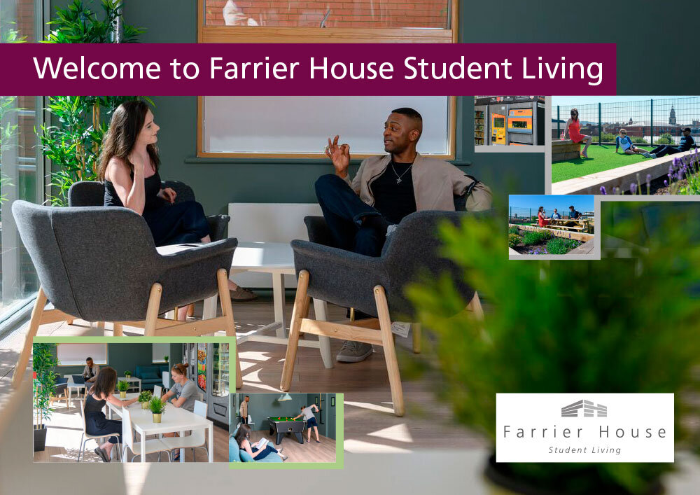
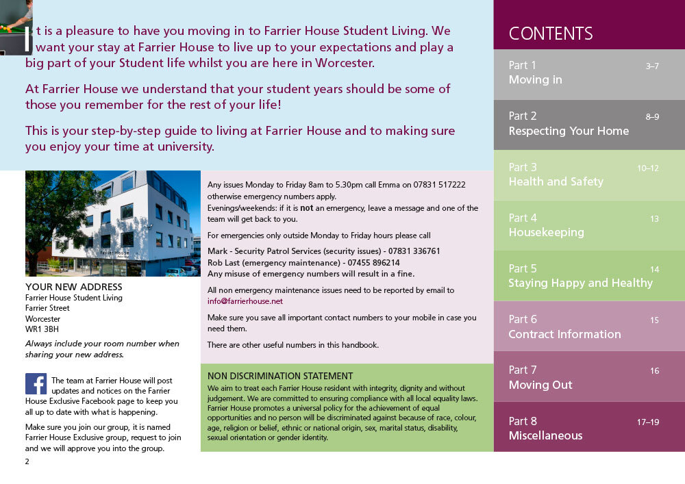
Farrier House is a quality student accommodation in Worcester and I did design some time ago a handbook for the students living there. The handbook is an interactive pdf with 19 individual pages and is well suited for full screen viewing with interactive navigation and external links. (You can view it here)
My client contact asked me for a version of the pdf that could be printed in a low digital print run as a brochure handout which they needed for a small event. The printer had asked for bleed on the file (the extra space of print outside the edges which will be cut off in finishing).
I immediately knew that the extra 3mm bleed was the least of the problems here – bleed is very quick to add. Even as an interactive pdf the original layout file is done in Adobe InDesign and can be used for both print and interactive.
The printer was not concerned with the design, they only wanted a file they could produce from and that is what they asked for. But in order to keep the client happy and make something they would be pleased with, I knew this was not enough.
Firstly, the interactive pdf has 19 pages. To make a saddle-stitched (magazine style) brochure we need 20 pages. We agreed to add a back page with logo and contact details as a quick fix (the printers would probably have printed a blank back page if no further instructions were given).
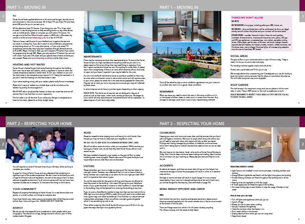
The pdf is also single pages with tabs on the right hand side and different margins on left and right side. To convert this to a file with spreads and inside/outside margins is quick. However, the margins would look very odd with the left page having a bigger inside margin than the right hand page. Also, tabs on left pages would be towards the spine, and that would definitely look strange.
I had to change all this to make the layout look symmetrical. There was also the minor issue of removing navigational symbols from the pdf as those were purely for interactive use.
As an experienced designer this was all straightforward art working. It all took one hour and 15 minutes and that is what the client was charged for.
Get in touch if you have any design and/or artwork needs.


